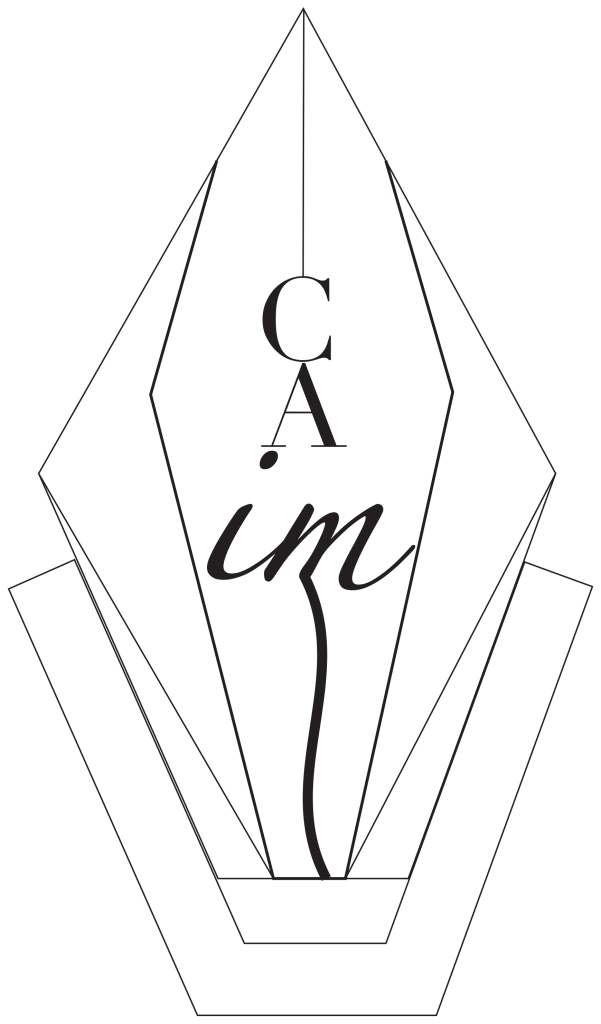
I have designed a logo for a future clothing line I hope to have. I wanted the logo to portray something simple so therefore it could be recognizable among the public. Having created my blog purely on fashion content, I felt it was only right to design a logo for the future clothing line I wish to have, and, in this case, it would be called, “Caim”. Caim would be the name because it means an invisible circle of protection, drawn around the body, that reminds you that you are safe and loved, even in the darkest times. The definition for this word was a perfect fit for my brand as it represented lots of its elements. The clothing line’s goal will be to provide comfort and promote high self-esteem through the items sold. When you wear these items, you will feel this sense of love and safeness, so it was a perfect match- they definitely complement each-other. I wanted to create something that could easily stick to the public, so the design process used various simple tools such as the line tool, scissors, curvature tool, and gradient fill. I wanted to create a diamond like structure as my logo, to once again promote simplicity and neatness in my brand. The process of creating it was clear-cut as I first decided to sketch it without any kind of resources or inspiration. I simply started free drawing shapes to see what I could come up with, which lead me to use cursive, as well as roman italicized font in the name. Some difficulties I encountered were that I was not able to add color to it. I would like to add more to it, but I am overall proud of the result of my logo, as it will not confuse the audience.

Athziri,
I can totally see this on a window for a store! The logo is the first thing that potential customers will see, and based on your logo I can see it being like a boutique. I do not know if you are familiar with the waterfront in Tacoma, Washington, but that is where I am picturing your store. There are a lot of small fashion businesses in that area. I do think that the bottom is busy, so maybe you could take off the bottom piece? I am not exactly sure of the vision that you had, so if that is exactly it, you can totally keep it. I just think that it might look a little bit more simple towards the bottom. I am a little confused about the middle of the diamond. I do not know if it is supposed to say Claim? If it is, I would instead have Claim going down vertically. I am not a pro with Illustrator, but if I were you I would use the text tool and use one letter at a time. Hopefully that makes sense? I know you were talking about adding color, but I think that it makes it more sophisticated. If you are aiming for your company to be a little pricey, I would keep the simple black and white look. I think Apple is a good example of a company that went from a lot of colors in their logo to just using black and white in their logo. The colors remind me of Gucci and Louis Vitton, so you could totally get away with having higher prices.
LikeLike
Incredible Logo! I really like the concept of creating a brand logo for your clothing line. I loved how 3D your logo looked. The way you added 3D shaped into your design made it elegant and sleek. One thing I would love to recommend is making the font sizes the same for all of your letters. I understand the design choice to have them connect to the rest of the piece. I was a little confused at the name at first just because of the different fonts. I think with all of it having the same font would help add flow to the logo. The only other thing I would recommend adding is some color to the piece. A ruby look to make it seem like a diamond. I’ll leave that choice up to you. Excellent work and I cannot wait to check out the finished logo! Good luck and I think this will turn out excellent.
LikeLike
Hello, Athziri. I love your design. I think it looks very fresh and unique. Your design gives a modern feel that would attract our generation. What I love the most was the originality of it, especially the use of the word “caim”. I think that word has a beautiful meaning, and it goes well with your design. You picked a really nice font, and the lines are visually appealing. Keep the long down stroke on the m; I think it gives the design a fluid appeal.
What you could do to make your design even stronger is making the lines on the bottom darker. This would help make the top part pop out and would give an edge to your design. The text could have a different color to provide contrast and attract more attention to it. Applying a drop shadow could also give the design a 3D texture.
The first time I looked at it, I thought it looked like the tip of a pen. Since your design relates to fashion, maybe alter the design’s width and height a bit in certain places so that your design looks like a representation of a human body.
Overall, it’s such a great design! Excellent job on keeping the design fresh and original.
LikeLike